10 UX Design Mistakes That Are Killing Your Conversion Rate
Discover the top UX design mistakes reducing conversions in 2026 and learn how friction-free UX improves revenue and user experience.
May 28, 2026
Written by

Introduction
Most businesses do not lose conversions because their ads fail. They lose them because of preventable UX design mistakes hidden within the user journey. Is your checkout too long? Is your mobile navigation confusing? Are slow-loading pages or cluttered UI design quietly driving users away? Every friction point reduces conversions.
In 2026, conversion rate optimization UX is no longer about making interfaces look modern. It is about removing effort. The brands growing fastest today are investing heavily in user experience optimization and digital experience optimization across devices, especially on mobile, where abandonment happens instantly.
At Millipixels, one pattern recurs across ecommerce and SaaS audits: brands redesign interfaces without addressing high-friction user flows. That is why many redesigns fail to improve business performance.
This article breaks down the biggest UX mistakes hurting conversions in 2026, why they fail psychologically, and the practical fixes modern teams are using to recover revenue. More importantly, it explains why decision-makers should treat UX as conversion infrastructure rather than a cosmetic design layer.
The Friction Economy: Why UX Is the New CRO
The biggest shift happening in digital products right now is that conversion optimization has become a friction-elimination problem. Users no longer tolerate confusing flows, delays, or unclear interfaces. They leave immediately.
Most conversion-killing UX problems fall into four friction categories:
| Friction Type | What Users Experience | Business Impact |
| Cognitive Friction | Users must think too much | Higher bounce rates |
| Interaction Friction | Too many steps or actions | Funnel abandonment |
| Trust Friction | Hidden fees or manipulative patterns | Lost confidence |
| Performance Friction | Slow loading or lag | Session drop-offs |
These friction points can also reveal opportunities for customer experience transformation across the broader journey.
This framework matters because it changes how leaders should evaluate UX investments. High-performing digital products are not necessarily visually impressive. They are operationally efficient. They remove hesitation.
One of the most important shifts in user experience optimization is recognizing that modern users behave in a transactional way. They no longer explore interfaces patiently. They scan, evaluate friction instantly, and leave the moment effort exceeds perceived value.
To understand where businesses lose momentum, let's break down the 10 most damaging UX design mistakes hurting conversions in 2026 and how high-performing teams are fixing them.
1. Outdated Authentication Systems Create Intent Drop-Off
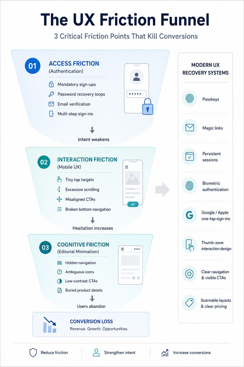
One of the most common UX design mistakes that USA businesses continue to make is forcing users into outdated authentication flows during high-intent moments. Mandatory account creation, password-recovery loops, email-verification friction, and multi-step sign-ins create unnecessary interruptions in the purchase journey.
This is particularly damaging on mobile devices, where typing fatigue already increases abandonment risk.
Why This Hurts Conversions
- Interrupts momentum during checkout
- Creates unnecessary mental effort
- Slows mobile interactions
- Increases cart abandonment
What High-Converting Products Do Instead
Modern authentication systems prioritize speed and invisibility:
- Passkeys
- Magic links
- Persistent browser sessions
- Biometric authentication
- Google and Apple one-tap sign-ins
The rise of passkeys is not just a security trend. It is a direct conversion optimization strategy.
2. Desktop-First UX Still Damages Mobile Conversions
Many businesses still approach mobile UX as a scaled-down desktop experience. This is a structural mistake. Understanding the latest trends in mobile app UX can help teams design experiences that better match how users interact with mobile products.
Mobile users interact differently. They navigate with their thumbs, scan vertically, expect instant responsiveness, and abandon far faster when friction appears. As a result, poor mobile adaptation creates tiny tap targets, excessive scrolling, misaligned CTAs, hover-dependent actions, and broken bottom navigation systems.
Modern mobile UX systems increasingly rely on real-time behavioral analytics, heatmaps, rage-click tracking, and session replay data to identify where users hesitate or abandon mobile flows. This matters because mobile friction compounds fast. According to Google data, 61% of users are unlikely to return to a mobile site they had trouble accessing.
This remains one of the most overlooked mistakes in bottom navigation bar design that mobile app UX teams struggle with.
The 2026 Mobile UX Standard
High-performing mobile experiences now prioritize:
- Thumb-zone accessibility
- Sticky bottom CTAs
- Single-column layouts
- Fast loading assets
- Simplified navigation
- Large touch targets
Many brands invest heavily in visual redesigns while leaving high-friction mobile interactions untouched. In most cases, conversion drops are caused less by aesthetics and more by usability breakdowns inside navigation, checkout, and mobile interaction flows. One recurring observation from mobile UX audits conducted by Millipixels is that businesses often prioritize homepage polish while neglecting the actual interaction points that impact conversion behavior.
Want to find the Friction Points Hurting Your Revenue?
Consult Millipixels3. Editorial Minimalism Often Reduces Clarity
Minimalism has become heavily overused in digital product design. Many brands now prioritize aesthetic restraint at the expense of usability. The result is interfaces with hidden navigation, weak CTA visibility, ambiguous icons, buried product details, and poor discoverability.
Users should never have to decode an interface.
This is one of the most common UX mistakes SaaS conversion rates suffer from because many SaaS products prioritize sleek dashboards and visual simplicity over operational clarity. In an attempt to look modern, teams often remove labels, reduce contrast, hide navigation inside icons, or bury critical information behind multiple interactions.
The real issue is cognitive friction. When users cannot immediately understand where to click, what the product offers, how pricing works, or how to move forward, hesitation increases instantly. Modern users do not spend time figuring interfaces out. They leave.
The highest-converting interfaces in 2026 are not the most minimal. They are the clearest. Strong UX systems prioritize visible navigation, high-contrast CTAs, obvious pricing structures, clear product messaging, and scannable layouts that reduce decision-making effort. Minimalism only works when discoverability remains effortless.
4. Multi-Step Checkout Funnels Still Kill Revenue
Every additional checkout step acts as a conversion tax. Yet many ecommerce experiences still force users through:
- cart review pages,
- account creation,
- shipping forms,
- billing pages,
- verification steps,
- and confirmation screens.
Each additional transition weakens momentum.
| Checkout Friction Point | User Reaction | Conversion Risk |
| Forced account creation | Frustration | Higher abandonment |
| Multiple form pages | Fatigue | Lower completion |
| Slow transitions | Distrust | Checkout exits |
| Re-entering information | Irritation | Funnel drop-offs |
What Modern Checkout UX Looks Like
High-performing ecommerce brands now prioritize conversion-focused eCommerce experiences, including:
- Single-page checkouts
- Accordion flows
- Autofill integrations
- Address prediction
- Express payments
- Inline validation
The strategic goal is to preserve intent, not to collect unnecessary data.
5. Weak CTA Hierarchy Reduces Action Visibility
Users do not read digital interfaces carefully. They scan rapidly, especially on mobile. If your primary CTA does not stand out within the first few seconds, users skip past it without noticing.
This problem is especially common in brands that over-prioritize aesthetic consistency. To maintain a “clean” interface, many businesses reduce button contrast, minimize CTA size, or use identical styling for primary and secondary actions. As a result, the most important action on the page loses visual priority.
Common examples include:
- "Buy Now" buttons blend into the background color
- Multiple CTAs competing within the same section
- Small clickable areas on mobile
- Text-heavy landing pages where actions get buried
- Weak spacing that prevents CTAs from visually standing out
This becomes even more damaging on e-commerce product pages and SaaS landing pages, where users make rapid decisions based on visual scanning patterns.
High-converting interfaces treat the CTA hierarchy as an attention-management system, not just a branding element. Strong UX systems use high-contrast action colors, clear spacing, strong, action-oriented copy, predictable placement, and minimal surrounding noise to guide users naturally toward the next step.
The goal is simple: users should never have to search for the primary action. The interface should direct attention immediately.

6. Broken Search and Filtering Systems Increase Bounce Rates
Search users are often the highest-intent users on a website. They already know what they want. If they cannot locate products, pricing, categories, or information within seconds, they leave immediately.
Yet many platforms still treat search as a secondary feature. Common problems include tiny search icons hidden in navigation bars, exact-match search logic that fails with small spelling variations, weak autocomplete systems, rigid filters, and poor tolerance for typos. A user searching for “running sneakers” should not receive zero results simply because the product category is labeled “sports shoes.”
These failures contribute heavily to website bounce rate reasons across e-commerce and SaaS platforms because they create instant frustration during high-intent moments.
The biggest issue is that outdated search systems force users to adapt to the platform instead of the platform adapting to user behavior.
The 2026 search experience is fundamentally different. Modern search architecture now uses semantic search, intent recognition, AI-assisted suggestions, dynamic filtering, predictive autocomplete, and multi-select filtering systems that adapt based on product category and browsing behavior.
For example, high-performing ecommerce experiences now allow users to filter products simultaneously by size, price, delivery speed, ratings, material, and availability without resetting the search flow. SaaS platforms are also increasingly using predictive search inside dashboards to reduce navigation friction.
Search is no longer just a utility feature. It is a revenue-critical conversion pathway.
7. Dark Patterns Destroy Trust Faster Than Teams Realize
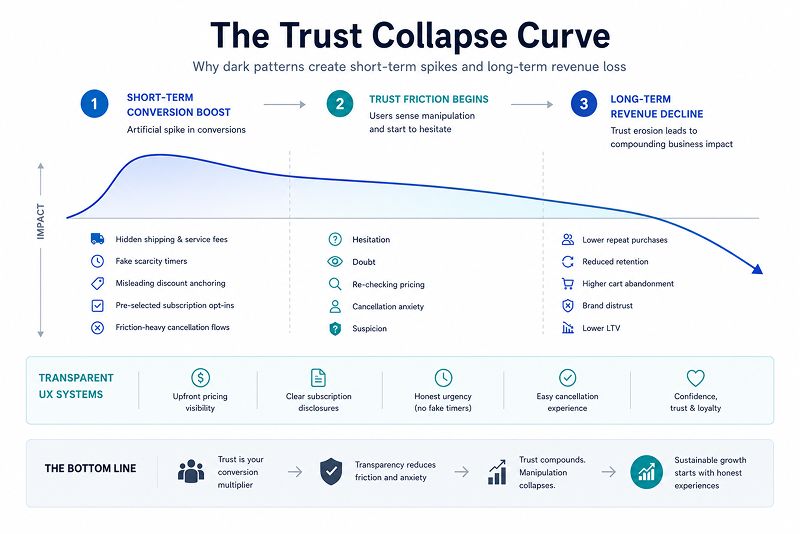
Users are increasingly able to identify manipulative UX patterns, especially during checkout and subscription flows. Hidden fees, fake-urgency tactics, and deceptive pricing structures may create temporary boosts in conversions, but they damage long-term trust and retention.
Some of the most damaging dark patterns include:
- Hidden shipping and service fees
- Fake scarcity timers
- Misleading discount anchoring
- Pre-selected subscription opt-ins
- Friction-heavy cancellation flows
These patterns create trust friction. Once users perceive manipulation, hesitation increases immediately. Cart abandonment rises, checkout confidence drops, and repeat purchase intent weakens.
From a conversion-systems perspective, deceptive UX quietly reduces downstream revenue efficiency by eroding brand credibility.
The highest-performing brands in 2026 are moving toward transparent UX architecture with upfront pricing visibility, explicit subscription disclosures, and low-friction cancellation experiences that reduce transactional anxiety instead of exploiting it.
8. Missing Micro-Interactions Make Products Feel Broken
Users need continuous confirmation that the system is responding to their actions. When buttons freeze, forms provide no feedback, or loading states are unclear, users assume the interface has failed.
This creates:
- Rage clicking
- Duplicate submissions
- Session abandonment
- Increased support requests
The issue becomes even more damaging on mobile, where users expect immediate responsiveness and low-latency interactions.
Strong micro-interactions reduce uncertainty by providing real-time system feedback. High-performing products use loading states, inline form validation, progress indicators, success confirmations, and responsive interaction states to maintain user confidence throughout the journey.
For example, when a checkout button transforms into a loading spinner immediately after interaction, users understand that the action has been registered. Without that feedback, many users tap repeatedly or abandon the flow entirely.
Micro-interactions are not decorative animations. They are behavioral reassurance systems that reduce friction and preserve conversion momentum.
9. Accessibility Problems Exclude Users and Hurt Performance
Accessibility is still widely treated as a compliance requirement instead of a core usability standard. In reality, inaccessible interfaces create friction for a far broader audience than most businesses realize, including visually impaired users, neurodivergent users, keyboard-only users, older demographics, and even mobile users navigating in poor lighting or with unstable network conditions.
Many accessibility failures also overlap directly with top UI/UX mistakes that hurt your Core Web Vitals scores because poorly structured interfaces often introduce technical inefficiencies alongside usability issues.
Some of the most common accessibility failures include:
- Low text contrast ratios
- Missing keyboard navigation support
- Improper heading hierarchy
- Non-semantic HTML structures
- Missing ARIA labels
- Weak or invisible focus states
These issues reduce usability, slow navigation efficiency, and increase cognitive load across devices.
Modern UX systems are increasingly built around WCAG-compliant structures with semantic HTML, accessible interaction states, and clear navigational hierarchy. Accessibility is no longer just about inclusivity. It is about optimizing the overall user experience and reducing friction at scale. Accessibility improves usability for everyone.
10. Heavy Visual Assets Still Destroy Performance
One of the most damaging UX design mistakes in 2026 is sacrificing performance for visual excess. Many websites continue to overload pages with autoplaying videos, oversized media assets, excessive animations, bloated JavaScript bundles, and third-party tracking scripts that significantly degrade loading performance.
This remains one of the top UI/UX mistakes that hurt your Core Web Vitals scores.
The issue is not just technical. Slow experiences create immediate psychological friction. Users perceive laggy interfaces as unreliable, unstable, and lower quality. As loading delays increase, bounce rates rise, engagement drops, and mobile abandonment accelerates.
Modern sustainable UX design systems prioritize:
- Lazy loading for non-critical assets
- AVIF and WebP image compression
- Deferred JavaScript execution
- CDN-based asset delivery
- Reduced third-party script dependency
- Mobile-first asset optimization
In 2026, performance is no longer a backend concern. It is a conversion layer. Fast experiences feel seamless and trustworthy. Slow experiences feel broken before users even engage with the interface.
How Millipixels Designed a Scalable COVID Testing UX System Under Extreme Time Constraints
During the COVID-19 recovery phase, Millipixels partnered with Ambry Genetics to design a scalable digital experience supporting large-scale Return-to-Work and Return-to-School testing programs across schools, counties, and organizations.
The challenge involved rapidly changing workflows, strict HIPAA compliance requirements, aggressive launch timelines, and thousands of concurrent users, all while ensuring the experience remained simple and accessible across devices.
Instead of treating UX as a visual layer, the project focused on eliminating friction across the user journey.
Key UX Priorities
- Mobile-first usability
- Simplified navigation and workflows
- Scalable UX architecture
- Seamless patient access to testing services
- Rapid customization across organizations
Outcome
- Large-scale testing programs launched in just 10 days
- Platform supported thousands of concurrent users
- Mobile engagement increased by over 50%
- No major UI overhaul required during scaling
The project reinforced a core principle behind modern conversion-focused UX: high-performing digital experiences are built by reducing friction, simplifying decisions, and maintaining clarity at scale.
Old UX Thinking vs 2026 UX Thinking
| Old UX Thinking | 2026 UX Thinking |
| Minimal equals premium | Clarity equals premium |
| More steps increase security | Fewer steps preserve intent |
| Desktop-first design matters most | Mobile ergonomics matter most |
| Users will figure it out | Users abandon instantly |
| Aesthetic consistency drives UX | Friction reduction drives UX |
| More features create more value | Simplicity improves adoption |
| Complex onboarding improves education | Faster time-to-value improves retention |
| Search is a secondary feature | Search is a high-intent conversion pathway |
| Accessibility is compliance-driven | Accessibility is usability-driven |
| Performance is a developer concern | Performance is a conversion metric |
| CTAs should blend into branding | CTAs should dominate visual hierarchy |
| Long checkout flows feel secure | Compressed checkout preserves momentum |
| Users will tolerate loading delays | Users expect real-time responsiveness |
| Animation improves engagement | Responsive feedback improves trust |
| Data collection is the priority | User momentum is the priority |
| Homepage aesthetics matter most | Transactional flows matter most |
| Brands control the experience pace | Users control the experience pace |
| UX success is subjective | UX success is measurable behavior |
| Desktop navigation patterns scale to mobile | Mobile behavior requires dedicated UX architecture |
| More options improve discoverability | Curated choices reduce cognitive load |
| Hidden navigation feels modern | Predictable navigation improves usability |
| Redesigning visuals improves conversions | Removing friction improves conversions |
| UX is a design responsibility | UX is revenue infrastructure |
Quick UX Conversion Audit Checklist
Most conversion leaks are not caused by one catastrophic UX failure. They are caused by repeated micro-frictions across the customer journey. The problem is that teams often normalize these issues internally because they interact with the product every day. Users do not. They evaluate the experience instantly.
If users must:
- remember passwords during checkout,
- zoom in to tap buttons on mobile,
- wait without clear loading feedback,
- re-enter information across multiple forms,
- search repeatedly to find products or pricing,
- guess shipping costs late in the funnel,
- hunt visually for primary CTAs,
- decode unclear icons or navigation patterns,
- or navigate inconsistent layouts across devices,
your UX is actively reducing conversion efficiency.
These friction points increase cognitive load, weaken trust signals, and interrupt user momentum during high-intent actions. In most cases, users will not complain. They will simply abandon the session.
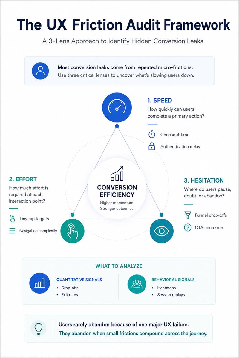
A practical way to audit these issues is to evaluate your product through three critical lenses:
- How quickly can users complete a primary action?
- How much effort is required at each interaction point?
- Where does hesitation appear inside the funnel?
High-performing teams combine quantitative data, like GA4 funnel drop-offs, with behavioral analysis tools such as Hotjar or Microsoft Clarity to identify where frustration occurs in real user sessions. One important mindset shift for decision-makers is this: users rarely abandon because of one major UX failure. They abandon because small moments of friction compound across the journey.
Conclusion: Friction Is the Real Conversion Killer
The companies winning in 2026 are not necessarily the ones with the most visually impressive products. They are the ones systematically removing friction across the user journey. Today, UX design mistakes directly impact conversion rates, retention, checkout completion, customer trust, and overall revenue efficiency.
The biggest mistake leadership teams still make is treating UX as a visual redesign exercise instead of a growth infrastructure problem. Small friction points inside checkout, mobile navigation, authentication, or search quietly compound into major revenue leakage over time.
If your bounce rates are rising, mobile conversions are underperforming, or users are dropping off during high-intent actions, the problem may not be your traffic. It may be your UX.
Want to identify the exact friction points hurting your conversions? Book a free UX conversion audit with Millipixels and get a strategic breakdown of the usability gaps, mobile friction issues, and conversion blockers impacting your digital experience today.
Frequently Asked Questions
1. Which tools are most useful for UX conversion rate optimization?
The most effective tools for conversion rate optimization in UX are the ones that help businesses identify friction, usability gaps, and behavioral drop-offs across the customer journey. Google Analytics 4 is widely used for funnel tracking, while Hotjar, Microsoft Clarity, and FullStory help teams analyze heatmaps, session recordings, and user frustration points. These tools support better user experience optimization by helping businesses understand how users interact with websites and apps.
For digital experience optimization, Lighthouse and BrowserStack are among the best tools for optimizing digital experiences across devices in 2026. They help teams evaluate mobile responsiveness, loading speed, Core Web Vitals, and cross-device consistency. Modern UX teams are no longer focused only on traffic performance. They are focused on reducing friction and improving conversions through better usability.
2. What are the most common UX design mistakes that hurt conversion rates?
Some of the most common UX design mistakes include cluttered UI design, confusing navigation, weak mobile responsiveness, forced account creation, slow-loading pages, hidden pricing, poor CTA visibility, and accessibility failures. These issues increase friction, confuse users, and contribute to higher bounce rates and lower conversions. Many common UX design mistakes in the USA are small usability problems that compound across the funnel over time.
Common UX mistakes that reduce SaaS conversion rates also include complex onboarding flows, feature-heavy dashboards, and unclear product value. On mobile platforms, bottom navigation bar design mistakes in mobile app UX, such as overcrowded menus and poor thumb-zone accessibility, can significantly hurt usability. Many of these are also top UI/UX mistakes that hurt Core Web Vitals scores, making performance and usability optimization equally important for improving conversions.
3. How does a cluttered UI design affect website bounce rates?
A cluttered UI design increases website bounce rates by overwhelming users with excessive visual noise, poor hierarchy, and too many competing actions. Common website bounce rate reasons include intrusive popups, confusing navigation, weak CTA visibility, and overcrowded layouts. Strong user experience optimization simplifies decision-making and guides users clearly through the interface.
4. What are the best tools for optimizing digital experiences across devices in 2026?
Some of the best tools for optimizing digital experiences across devices in 2026 include Google Analytics 4, Microsoft Clarity, Hotjar, Lighthouse, and BrowserStack. These platforms support digital experience optimization by helping teams monitor mobile responsiveness, behavioral friction, Core Web Vitals, and cross-device usability issues.
5. How do bottom navigation bar design mistakes impact mobile app UX and conversions?
Bottom navigation bar design mistakes in mobile app UX can significantly reduce usability and conversions. Common issues include overcrowded menus, tiny touch targets, inconsistent icons, and poor thumb-zone accessibility. Effective user experience optimization focuses on thumb-friendly navigation, simplified interaction flows, and clear access to high-intent actions.
6. How can SaaS businesses fix common UX mistakes to improve conversion rates?
To fix common UX mistakes that reduce SaaS conversion rates, businesses should simplify onboarding flows, reduce dashboard complexity, improve CTA visibility, and shorten the time-to-value experience. Some of the best bounce rate reduction tips for SaaS platforms include improving mobile responsiveness, fixing accessibility gaps, and addressing top UI/UX mistakes that hurt Core Web Vitals scores.
Written by

Parthsarathy Sharma
With 4+ years of experience across AI, UX, GCC/outsourcing, enterprise technology, and brand strategy, Parthsarathy brings a research-driven lens to digital experience content. His work focuses on turning emerging technology, customer experience, and business trends into clear, practical perspectives for readers.